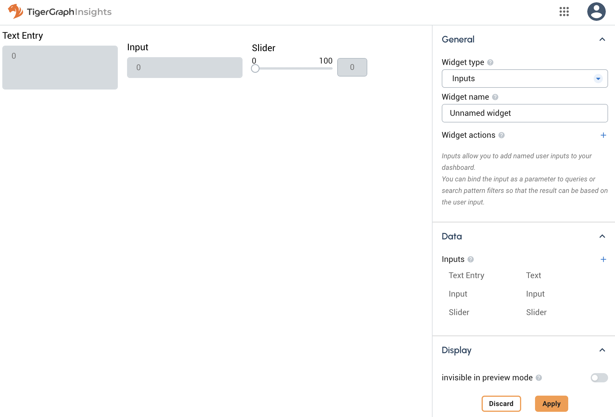
Inputs Widget
The Inputs Widget allows you to accept user input that is then used inside a search pattern by another widget to change the display.
It has no function when used alone. Rather, it works in concert with other widgets to make an interactive application.
Other widgets support filtering a pattern matching query based on vertex attributes.
For example, a financial database might have an amount attribute.
You can filter this in a pattern matching query using normal arithmetical operators like <, >, = and several more to restrict the financial transactions shown by amount.
The Inputs widget allows you to essentially declare a variable in your application that can later be changed by user input. Instead of filtering a pattern matching query based on an integer, you can filter it based on an input name.
Widget window

Configuration
Input name
The name by which other widgets can refer to this Input widget. This is analogous to a variable name in a programming language.
Input type
The input widget can take various forms.
-
Input: Choose between various data types:
-
Number: any
FLOATorINTdata type -
String: any text string without newlines
-
Date: a string formatted as a date
-
Time: a string formatted as a time
-
Vertex: a vertex type and ID that can be passed into a GSQL query.
-
-
Text: text input that supports newlines.
-
Slider: define start/end values and the size of the step.
-
Dropdown: define a set of values for the user to choose from. The Dropdown is useful for creating an interface for key:value pairs, for example, employee names and ID numbers. If your dataset includes only ID numbers but your users are unlikely to know them, you can use a Dropdown where you define name:ID pairs for ease of use. The users will see names, but the widget will see ID numbers.
-
Date Picker: use the browser’s date API to display a calendar for easy date picking.